New Google Calendar Controls for Android

Posted by muamar Jumat, 31 Mei 2013 0 komentar
Google Calendar's app for Android has been updated with new controls for selecting time, date, timezones, colors and editing repeating events. I wonder if the next Android version will use these controls instead of the existing pickers.

Selecting the time is a 2-part process: you first select the hour and then the number of minutes. The time picker is based on a real 24-hour clock.


Selecting the date is straightforward: Google uses a scrolling calendar that's great for picking a date from the current month or next month. If you want to pick a date from a different year, tap the year and you can quickly switch to 2014, 2015 or any other year.


Here are the standard time/date Android pickers that were previously used by the Google Calendar app. "Each picker provides controls for selecting each part of the time (hour, minute, AM/PM) or date (month, day, year). Using these pickers helps ensure that users can pick a time or date that is valid, formatted correctly, and adjusted to the user's locale."


And here are the original pre-Honeycomb pickers:


The control for repeating events looks much better. "You can now set events to repeat every Tuesday and Thursday, every month, or every 7 weeks, it's completely up to you," informs the Android blog.


Now you can pick different colors for events and calendars:


There's also a different way to select time zones: instead of showing a long list of time zones, countries and regions, Google Calendar lets you enter the country name and it displays the relevant time zones.


I've found it easy to compare the old and new controls because my phone has both the stock Calendar app and the Google Calendar app from Google Play. It's a good idea to disable the notifications for one of the apps if you don't want to get multiple notifications for the same event.

Baca Selengkapnya ....

Google's Unified Storage Plans

Posted by muamar 0 komentar
As previously anticipated, Google's 25GB plan will no longer be available for new users. It was the most affordable storage plan: $2.49/month. Now the cheapest plan offers 100GB for $4.99/month, but it's shared storage that can be used in Google Drive, Gmail, and Google+ Photos.

OLD:


NEW:


"Store up to 15GB in Google Drive, Gmail, and Google+ Photos, and then pay for additional storage as your account grows," informs Google. Paid storage no longer increases Gmail's storage limit to 25GB, but now the entire storage is shared between Google Drive, Gmail, and Google+ Photos.

You can still find the old plans here, so I suggest to choose the 25GB plan if you need more storage because it will be removed soon. You'll also get some additional Gmail storage.

Existing users will keep the old plans. "If your account lapses, your credit card is declined, or you choose to change your storage plan in any way (upgrade or downgrade), you'll be asked to choose from among the new Google Drive storage plans. Once you choose a new plan, you'll no longer be able to switch back to the old one." I still have the plan that offered 20GB of storage for only $5/year.


{ Thanks, Florian K. }

Baca Selengkapnya ....

LOOK TV.....Design School With Nick Verreos, First Videos Up Now: Pattern Making 101, The Quick Sketch, Drawing Croquis!

Posted by muamar Kamis, 30 Mei 2013 0 komentar


 Look TV "Design School With Nick Verreos" Videos on YouTube


Recently I filmed a lot of fun--and educational--videos for Look TV, a FABULOUS Fashion & Beauty YouTube Channel. In the past I did some great Project Runway videos for Look TV and they decided it was time to do some more with me, but this time "Design School With Nick Verreos".


 Pattern Making, Quick Sketches and How To Draw a Croquis...With Nick Verreos--Look TV Design School With Nick Verreos


In the videos, I will "teach" and enlighten the Look TV viewers--but in a fun "Nick way"--will discuss topics such as the basics of Fashion Design, Sketching (Fashion Illustrations, Quick Sketching, Croquis Sketching), as well as Draping, Inspiration, Couture, Ready-to-Wear...and so much more!


I will also give some "Nick's Tricks", short-and-sweet videos showing some of my "Nick's Tricks of the Trade" for everyone to use. These "Trick's" will include quick tips on sewing, drawing and much more. We filmed most of the videos at my NIKOLAKI/NV Nick Verreos work studio/atelier in Los Angeles, which the Look TV crew turned into a makeshift design studio...wait, IT IS A Design Studio!


Who's That Behind Me? Nick Verreos get's filmed--Look TV "Design School With Nick Verreos", NIKOLAKI design studio


I'm so EXCITED to announce that the first videos are up now on  Look TV's YouTube Channel---So Check them out! First up:

*Pattern Making for Fashion Design: The Basics

*The Quick Sketch: Design School w/ Nick Verreos, and

*How To Draw Your Own Croquis


Pattern Making for Fashion Design--the Basics/Look TV Design School With Nick Verreos:


The Quick Sketch--Look TV Design School With Nick Verreos: 


Nick's Trick's--How To Draw Your Own Croquis/Look TV Design School With Nick Verreos:


Click HERE for more Look TV videos!

And LOOK out for more Look TV "Design School With Nick Verreos" Videos!

Baca Selengkapnya ....

HTC One, Nexus Edition

Posted by muamar 0 komentar
After Samsung Galaxy S4, it's time for HTC One to get a Nexus Edition. It will be available on June 26 from Google Play US for $599, $50 less than Samsung's flagship.

"The unlocked device will run on both AT&T and T-Mobile in the United States with support for high-speed LTE data on both networks. This 'Nexus user experience' version will contain 32GB of built-in storage. Much like the special edition Samsung Galaxy S4 unveiled during I/O, Google will be directly handling future software updates," reports The Verge.


The Google Play version of HTC One will run stock Android, but it will have the same hardware like a regular HTC One. For example, it will have an infrared blaster that can't be used by Google's software because the stock Android 4.2 doesn't support IR. It's likely that a future Android update will add native support for infrared sensors.

I've mentioned in the post about Galaxy S4 that the Nexus Edition is great for Google, phone manufacturers, developers and users. Even if you don't buy this phone, you'll be able to install Google's software or a custom ROM that uses it.

Why use the stock Android instead of HTC's Android flavour or Samsung's Android flavour? It doesn't include so much bloatware, it's faster and easier to update. You'll miss features like HTC's Zoe or Samsung's Smart Pause, but you'll get a phone that's more responsive, has a modern interface and can take advantage of the latest software updates. Still, Nexus Edition phones aren't Nexus phones, so don't expect the same experience. The software wasn't designed with this hardware in mind.

Maybe the 'Nexus user experience' project has a different goal: show the difference between the pure Android and custom Android, running on the same devices. Maybe this will convince users that the stock Android is better and phone manufacturers will have to use it or at least provide an option to switch to it. As the stock Android improves, it's time to use it and build upon it, instead of hiding it behind useless features.

Baca Selengkapnya ....

Tips for Gmail's Tabs and Categories

Posted by muamar 0 komentar
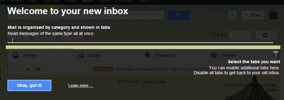
Some of you have already seen this screen in Gmail, which shows that the new inbox tabs have been enabled for your account. If not, click the gears button and see if you can find "Configure inbox". Click this menu item and you can use the new feature. If you can't find "Configure inbox", check back later.


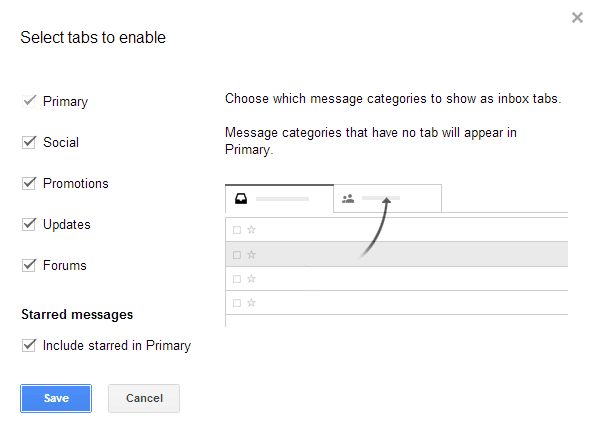
There are 5 tabs:

- social messages from sites like Facebook, Twitter, YouTube or Google+

- promotions: newsletters, offers and other bulk messages

- updates: confirmations, bills, receipts

- forums: messages from online groups, discussion boards, and mailing lists (hidden by default)

- primary: shows all the other messages


It's important to keep in mind that the tabs only show the messages from your inbox. If you have filters that automatically archive messages, you'll not see them in the new tabs.

If you've used the SmartLabels feature from Gmail Labs, you can delete the associated labels and filters after disabling the feature. Filters look like this: Matches: label:social-updates Do this: Skip Inbox. SmartLabels had the following names: social updates, promotions, notifications, forums. Inbox tabs replace the SmartLabels feature: instead of archiving messages, you can keep them in your inbox, but in separate tabs.

Here are some tips that should help you use the new feature:

Inbox tips

1. Click the "+" button to hide or show tabs. You can hide all the tabs except Primary to go back to the old inbox. This doesn't disable categorization, so you can use all the tips from the Categories section (starting from #6).


2. Starred messages are added to the Primary tab, but you can disable this option by clicking the "+" button and unchecking "include starred in Primary".

3. Drag inbox messages to a different category or right-click and select "move to tab".

4. Tabs show the number of unread messages and a list of senders. The inbox unread count only shows the number of unread messages from the Primary tab.

5. Keyboard shortcuts:
` Go to the next inbox tab
~ Go to previous inbox tab

Categories tips

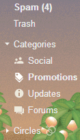
6. There's a new Categories list in the sidebar that lets you find all your notifications, promotions, social updates, not just the messages from your inbox. The list is still displayed if you hide some inbox tabs, but you can collapse it. Click "Categories" to see the messages from all the categories.


7. Search for category:updates, category:social, category:forums, category:promotions to find these messages.

8. You can create filters that use these categories. For example, create a filter that forwards all forum-related messages to a different address.

9. Create filters that exclude messages from these categories by enabling "Exclude from SmartLabel categorization" in the filter editing dialog.

10. Help Gmail categorize messages by creating filters and selecting "categorize as". For example, send all messages that include "unsubscribe" to the Promotions category.


11. You can also drag messages to the sidebar categories and use feature like "move to" or "labels" to categorize messages. The list of categories is displayed below your labels.

Baca Selengkapnya ....

No More Gmail Sneak Peek

Posted by muamar 0 komentar
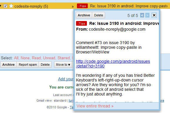
Gmail had a cool Labs feature that allowed you to read messages without opening them. Message Sneak Peek displayed the first sentences from a message when you right-clicked it. You could use keyboard shortcuts to navigate to the previous or to the next message, so this was a great to quickly read messages.


Here's a screenshot from 2010, when this feature was launched:


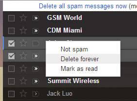
The Labs experiment is no longer available and now Gmail has a contextual menu that shows features like "move to inbox", "archive", "delete", "mark as read/unread", "move to tab" (for inbox messages). You can select multiple messages, right click and use one of the features that were also included in the Gmail toolbar.


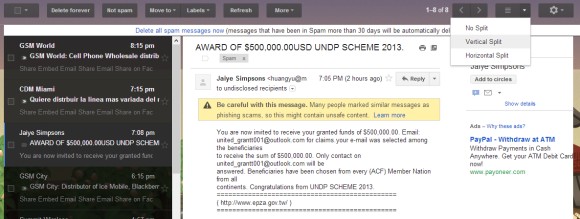
If you're missing Sneak Peek, try Preview Pane, another Labs experiment that lets you read messages in a vertical/horizontal pane like in Outlook or Gmail for tablets.


Don't forget that "Gmail Labs is a testing ground for experimental features that aren't quite ready for primetime. They may change, break or disappear at any time."

{ Thanks, jp (banana). }

Baca Selengkapnya ....

New Gmail Favicon

Posted by muamar 0 komentar
Gmail has a new favicon that looks like the icon used by Gmail's Chrome app. It's also close to the iOS app's icon.

In this screenshot, the first tab shows new the new favicon, while the second one shows the old favicon. There's also a bigger version of the new favicon.


A similar screenshot for Internet Explorer:


Here's the same icon in Chrome's new tab page. The Gmail app for Chrome is installed by default.


If you don't see the new favicon, reload Gmail using F5 or Ctrl+F5. If you don't like the new icon, you can go back the old one by enabling "Unread message icon" in Gmail Labs. This feature only works in Chrome, Firefox and Opera and it lets you see "how many unread messages are in your inbox with a quick glance at the tab's icon".

Baca Selengkapnya ....

Chrome for iOS, Not a Fast Browser

Posted by muamar 0 komentar
Chrome for iOS doesn't have a lot of things in common with the desktop Chrome or Chrome for Android. It doesn't use the latest WebKit rendering engine and can't switch to Blink, it doesn't use the V8 JavaScript engine, it doesn't have a multi-process architecture. These are iOS limitations and all third-party iOS browsers are built using UIWebView, so they use the same rendering engine and the same JavaScript engine, which is slower than Safari's Nitro (Opera Mini is just an OBML reader, not a browser, because pages are rendered using Opera's servers).

I was surprised to see an ad for Chrome when visiting Google's homepage in Safari for iPad: "Browse fast on your iPad. Install Google Chrome." Chrome for iOS is not fast, it's a lot slower than Safari and that's not Google's fault. It's even a little bit slower than other third-party browsers.


Even the Chrome for iOS homepage claims that you can "browse fast and sign in to bring your Chrome experience from your computer, anywhere you go". Sure, Chrome combines the address bar and the search box, preloads web pages and shows the most visited pages, but it's not a faster browser than Safari.

From Tom's Hardware: "In the end, any third-party Web browser on iOS is essentially tantamount to using an older version of Safari with a slightly different user interface and additional features. Due to Apple's App Store mandate that all third-party iOS browsers utilize Safari's stock engines, browser competition on this mobile operating system is practically non-existent. Unless Apple reverses course, allowing other developers to compete using their own unique rending and JavaScript engines."

Baca Selengkapnya ....

FLIGHT ATTENDANT COUTURE....New Turkish Airlines and United Airlines Uniforms: Which Ones Are The Worst?

Posted by muamar Rabu, 29 Mei 2013 0 komentar


Ottoman Empire Queens...and a King: the (unofficially) new Turkish Airlines flight attendant uniforms, designed by Turkish fashion designer Dilek Hanif’s


Two things have recently caused a big "stir" on the web in regards to "Flight Attendant Couture". One had to do with the new uniforms for Turkish Airlines and the other, the ones for United Airlines. Both were not so good. So naturally, since I LOVE ME some Flight Attendants (especially those 70's/80's fierce ones!), I had to discuss.


 Turkish Airlines Mumsy


First off: last month, a big Twitter and Web hub-a-loo occurred when photos of the supposed new designs for Turkish Airlines uniforms were "released" and well, most people were not very amused. Turkey’s proposed new and more modest dress code for its flight
attendants has been criticized by the country’s seculars with some
Twitter users deriding the new suggested uniforms as reminiscent of the
costumes worn in the Ottoman Empire.


 The Current Flight Attendant Uniform, Turkish Airlines


Critics likened the suggested uniforms to those worn in the
“Magnificent Century,” a popular Turkish soap opera about the decadent
reign of Sultan Suleiman the Magnificent in the 16th century. Many found these new
"uniforms" to be too conservative: “Even my students with head scarves find these ridiculous,” said Ayse Saktanber, a sociologist at the Middle East Technical University in
Ankara.


The
uproar has cast a spotlight on the Turkish designer Dilek Hanif (above), who
was commissioned by the airline to redesign the uniforms. Hanif's designs are often
inspired by Ottoman fashions, and she is said to be a favorite of
Turkey’s head-scarf-wearing first lady, Hayrunnisa Gul. In
an interview, Ms. Hanif said the uniform designs that appeared online
were not final. She attributed the negative reaction to the callousness of the fashion industry, apparently as
fierce in Istanbul as it is in New York, Paris and Milan. “Contrary to the photos that were leaked,” she said, “we are also working on a range of modern designs”...“I
am still working on different designs, colors and alternatives,” she
said. “When the designs are finished, they will be presented to Turkey
and the world.” I'm not sure about these supposed new uniforms.


They do look a tad bit too conservative and "Mumsy". I LOVE the little "Fez" hats but the rest is a bit of a mess. And poor BOY: what is he wearing? It is like outfits a Costume Designer would come up with for a really campy Almodovar film about Turkish Airlines flight attendants. Seriously. I still kind of wish the Turkish Airlines uniforms looked like these:


Turkish Airlines Uniforms, 1970's


Now, let's discuss the drab, un-imaginative new United Airlines uniforms:


Welcome Aboard...Now Be Bored by Our Uniforms--the new United Airlines uniforms


First off: Oh Dear! This is making me want to order THREE Bloody Mary's really quick. These have to be some of the most DRAB uniforms I have ever witnessed...since my last American Airlines flight! GREY? Bland Blue? Too-long sleeves, too-long hem lengths? Are we at Church? OK, I'll stop...Let's talk about what is going on here:


Starting June 25, United Airlines employees will don uniforms that further underscore
the reality that United is a new airline sprung from the merger of
United Airlines and Continental Airlines. The new designs come in various shades of blue, gray and black, a
range of colors familiar to passengers of both the merged carriers. According to a United spokesman, the airline did not seek out a name
fashion designer to create the new look. Rather the carrier considered
several suppliers, but finally went with the one that made what United
employees considered the most comfortable, yet attractive options. The uniforms were made--and designed by a very formidable uniform company, Cintas. However, I remember when...


Back in 2009, Cynthia Rowley was named as the designer who was hired to create the new United Airlines uniforms. However, according to some news reports, Rowley abruptly left during the project's final stages in 2011 when new
management heads, post-merger, demanded downgrades in the materials used.
She refused to put her name onto said materials. I'm sure she still got payed a nice amount of money for it all--even though it never came to fruition. I heard some different rumblings through "the grapevine" about what really went down but that's for "Nick off-the-record Cocktail Hour" darlings...The end result (the newly-released United Airlines Uniforms), I think, are rather drab and un-creative; very "corporate" from my point of view. I get that, nowadays, the flight attendants don't look like FAB Braniff  Emilio Pucci-designed Stewardesses. But...why should they look like "Sister Wives" of a Mormon Compound? Just my "Nick Two Cents".


Click Below to Watch the new United Airlines Uniforms Fashion Show Presentation:


With all this above, my favorite Flight Attendant Uniforms remain being:


Emirates Airlines Flight Attendants


Korean Air Flight Attendants


So which is WORSE? The new (supposed) Turkish Airlines uniforms or the (ba-ba boring) United Airlines ones? Let me know!


Baca Selengkapnya ....
Trik SEO Terbaru support Online Shop Baju Wanita - Original design by Bamz | Copyright of android kindle.